Executives find themselves waiting for reports, while managers spend too much time gathering data and creating spreadsheets. This manual process not only consumes significant time but also introduces human error into your most critical KPIs.
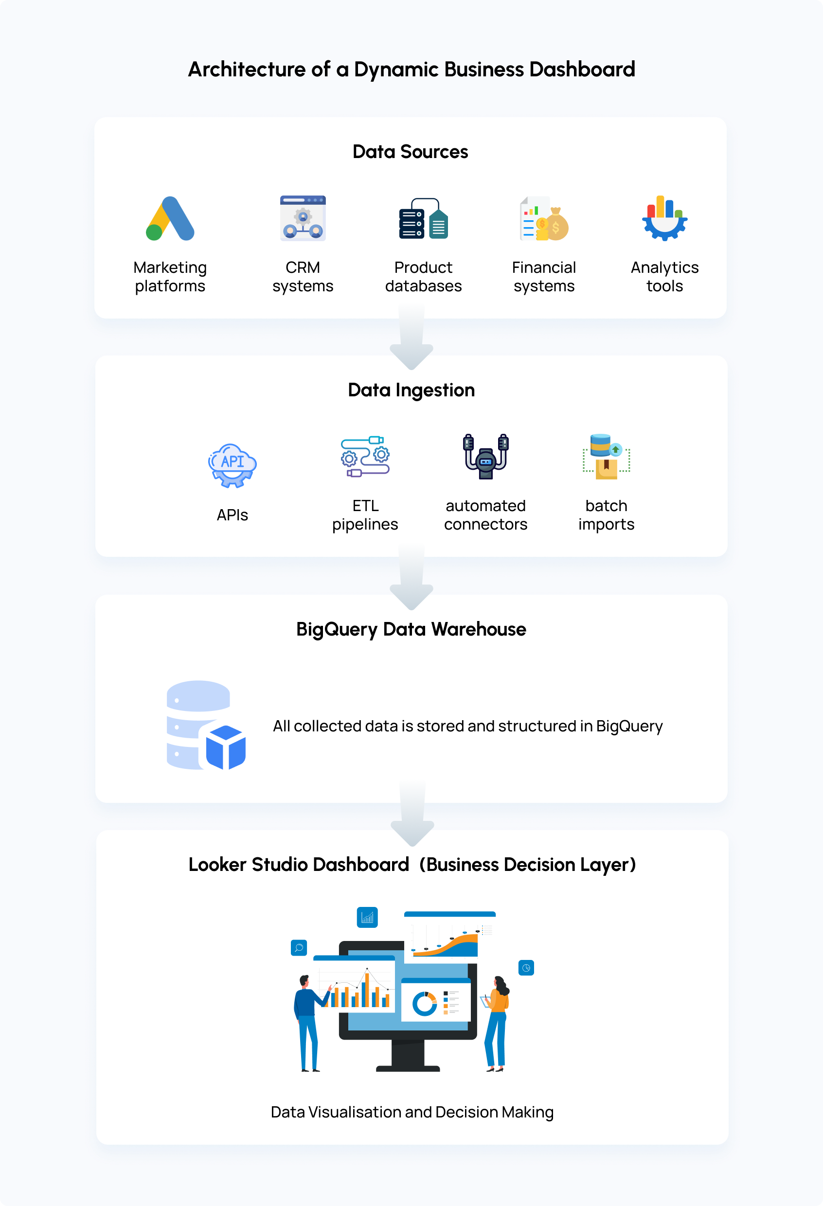
As businesses generate massive volumes of data from multiple platforms, including CRM systems, analytics platforms, financial systems, and internal databases, deriving insights from it all becomes a major challenge. Without a clear, unified view, misaligned metrics can lead teams to prioritize the wrong things.
What if a dashboard could consolidate data from all your systems and provide insights at a glance?
This is why businesses build dashboards using BigQuery and Looker Studio. BigQuery acts as a scalable cloud data warehouse that stores and processes large datasets, while Looker Studio transforms that data into interactive dashboards that help businesses visualize trends and performance in real time.
By combining these two tools, businesses can build dynamic business decision dashboards that unify multiple data sources and provide actionable insights for executive teams. The following steps show how to build a dashboard that gives real-time BI reports.
Why Combine BigQuery and Looker Studio
Your data is a huge library of multiple systems of information, and Google BigQuery is a cloud data warehouse that stores all the data in one place without the need for on-premise servers.
Looker Studio then transforms that data into interactive dashboards, helping teams visualize trends, performance metrics, and patterns in real time.
Connecting BigQuery to Looker Studio lets teams:
Extended Data Retention: While many analytics tools limit data storage, BigQuery allows businesses to store historical data long-term.
This lets teams analyze trends and performance over multiple years, offering insights that short-term reporting cannot provide.
Custom and Complex Data Models: Looker Studio allows analysts to build custom dashboards using SQL, while BigQuery’s powerful query engine enables more complex queries than typical analytics platforms.
This gives teams the flexibility to structure and analyze data in ways that directly align with business needs.
Scalability and Performance: BigQuery is built to handle large-scale datasets with fast query response times. By connecting it with Looker Studio, dashboards remain responsive and reliable even when analyzing millions of records, making performance insights delivered efficiently across the organization.
Step-by-Step Guide to Building a Dashboard Using BigQuery and Looker Studio
Building a reliable dashboard with BigQuery and Looker Studio is not just about connecting tools. It involves defining the right metrics, structuring the data correctly, and designing visualizations that make insights easy to understand. The steps below outline a practical process used to build scalable analytics dashboards.
Step 1 - Identify Business KPIs for Your Dashboard
Before touching BigQuery or Looker Studio, spend real time here. A dashboard built around vague goals ends up cluttered with metrics nobody checks.
Ask these questions to define your KPIs:
What decisions does this dashboard need to support? (e.g., budget reallocation, churn prevention, inventory restocking)
How frequently does this data change – hourly, daily, weekly?
Document 5–8 KPIs maximum per dashboard. Common examples: revenue, ROAS, churn rate, or pipeline velocity. Fewer, well-defined metrics are enough to create a dashboard.
Map to data sources (e.g., GA4 events, Shopify orders) and define success thresholds (e.g., >15% MoM growth).
Step 2: Connect Data Sources to BigQuery
The first step in building a reliable dashboard is centralizing all relevant business data in BigQuery. When data is scattered across different platforms, teams often rely on spreadsheets or multiple reports to understand performance.
Moving these datasets into BigQuery creates a single source of foundation where information from different systems can be combined and analyzed consistently.
Businesses pull data from a mix of operational and marketing tools, it could be:
- Google Analytics (GA4) exports for website traffic, user behavior, and conversion data
- CRM systems for leads, sales pipelines, and customer lifecycle data
- Marketing platforms such as advertising networks, email platforms, or campaign tools
- Financial systems that record transactions, revenue, and subscription activity
Step 3: Model Your Data in BigQuery
Before a dashboard can deliver useful insights, the data behind it needs to be structured. Data coming from multiple platforms often follows different formats and naming conventions, which makes direct reporting unreliable. Modeling the data in BigQuery ensures that metrics are consistent, organized, and ready for analysis.
Start by cleaning and standardizing the raw data. This may include removing duplicate records, aligning naming conventions across platforms, and making sure important fields follow a consistent format.
Following that, you can organize the data into logical tables instead of storing everything in one large dataset. Separating data by business functions makes analysis easier and queries faster. For example, you might maintain dedicated tables for:
- Revenue and transaction activity
- Marketing campaign performance
- Customer acquisition and lead data
- Product or feature engagement metrics
Structuring tables this way allows dashboards to retrieve only the information they need, rather than scanning large volumes of unrelated data.
Another important step is preparing commonly used metrics in advance. Instead of calculating totals or averages every time a dashboard loads, these values can be aggregated inside BigQuery. This reduces processing time and keeps dashboards responsive even when datasets grow.
Step 4 - Connect BigQuery to Looker Studio
Linking BigQuery to Looker Studio lets you turn structured data into interactive dashboards. Follow these steps:
- In Looker Studio, create a new data source and choose the BigQuery connector.
- Select the project, dataset, and view you want to use as the foundation for your dashboard.
- Set credentials either, OAuth for personal access or a Service Account for team-wide access.
- Define a date field if you need time-based analysis, and click Connect to load fields.
- Refresh fields to ensure Looker Studio recognizes all columns correctly.
- Verify the connection by previewing rows to ensure data loads instantly and correctly.
Step 5 - Build an Interactive Dashboard and Visualizations
Once your BigQuery data is connected, it’s time to build the dashboard in Looker Studio. A well-structured layout helps quickly analyze:
1. Layout design:
- Top row: Scorecards showing key metrics like revenue or active users.
- Middle section: Trend lines to visualize daily or weekly performance over time.
- Bottom section: Tables and funnel visualizations to track process stages or conversions.
2. Add controls for interactivity:
- Date range selector: Default to the last 30 days.
- Dropdowns: Filter by region, campaign, or other dimensions relevant to your business.
- Common interactive components: Date range filters, channel filters, regional filters, drill-down charts, or comparative performance metrics.
Best Practices to Build a Dashboard That Delivers Clear Business Insights
1. Create with the audience in mind
Before building a dashboard, understand who will use it and what decisions they need to make. Executives usually need quick summaries, while analysts may require deeper data exploration.
2. Use the right visualization for the data
Different types of data require different chart formats. For example, line charts work well for trends over time, while bar charts are better for comparing categories. Choosing the correct visualization makes patterns easier to understand at a glance.
3. Keep dashboards simple and uncluttered
Too many charts, colors, or labels can overwhelm anyone. Focus on the most important insights and remove unnecessary visual elements so the key information stands out clearly.
5. Arrange information in a logical order
Place the most important metrics at the top of the dashboard and supporting details below. This structure allows users to quickly scan high-level insights before exploring deeper data.
Case Study: Building an Interactive Dashboard at Absolute App Labs
We built Absolute 1Dashboard in response to a common enterprise challenge: separate data structures and slow, manual reporting processes that disturb timely insights. Businesses today collect data from multiple platforms but struggle to unify this data into a single view that improves decision processes.
Solution Overview
Absolute 1Dashboard is a smart analytics dashboard powered by BigQuery and Looker Studio. It consolidates data from multiple sources into a real‑time reporting platform.
The dashboard is designed for scalability, performance, and ease of use, enabling executive teams to access key business insights instantly without manual manipulation of data.
How It Works
Absolute 1Dashboard leverages:
BigQuery for scalable, cloud‑native storage and fast analytical processing.
Looker Studio for building interactive dashboards that surface trends, performance metrics, and unified insights without technical overhead.
These components reduces, relying on spreadsheets and legacy reporting tools, streamlining the path from data to decision.
What Absolute 1Dashboard Delivers
- Real‑Time Unified Reporting: Data updates continuously, giving teams visibility into current business performance.
- Customizable, Interactive Visuals: Dashboards display metrics like revenue, trends, and KPIs tailored to business needs.
- Automated, Always‑Synced Updates: The dashboard automatically ingests and refreshes data, eliminating manual ETL tasks.
Conclusion
With a structured dashboard powered by BigQuery and Looker Studio, decision-makers can unify data from every platform and track performance in real time. Having intelligent insights in today’s data-focused environment is quite essential.
To focus on what truly drives growth, teams can prioritize initiatives based on real-time metrics. Dashboard built by Absolute App Labs makes complex data instantly usable, helping leaders make decisions that move the business forward.
FAQ
How does BigQuery improve the performance of dashboards in Looker Studio?
BigQuery handles large volumes of data quickly, allowing dashboards to load instantly. By structuring and pre-aggregating data efficiently, dashboards stay fast and responsive even with millions of records.
What types of business metrics can be tracked in a Looker Studio BigQuery dashboard?
Dashboards can track revenue, customer behavior, marketing performance, operational KPIs, and product usage. Metrics are tailored to what drives decisions for your business.
How can large datasets be optimized for Looker Studio dashboards?
Large datasets can be optimized by preparing and structuring the data efficiently in BigQuery before it is used in dashboards. This includes organizing tables with techniques like partitioning by date, creating pre-aggregated tables or views, so dashboards do not process raw data each time they load.
What types of data can be integrated into a Looker Studio dashboard?
Use clear layouts with scorecards, trend lines, and tables. Add filters, date ranges, and “what-if” parameters for deeper exploration. The goal is actionable insights that are easy to interpret.
Who benefits most from dynamic business dashboards?
It depends on your business needs; it could be daily, hourly, or even real-time updates. Automated refreshes ensure decision-makers always have the latest data without manual effort.